3. Configuration
The back-office configuration is organized into 6 tabs. Each tab groups related settings.

3.1 General
This tab controls the overall module behavior, access restrictions, and navigation links.
At the top of the tab, a blue info box displays the current Quick Order page URL and a Change URL link that takes you directly to Shop Parameters > SEO & URLs where you can customize the page's friendly URL.
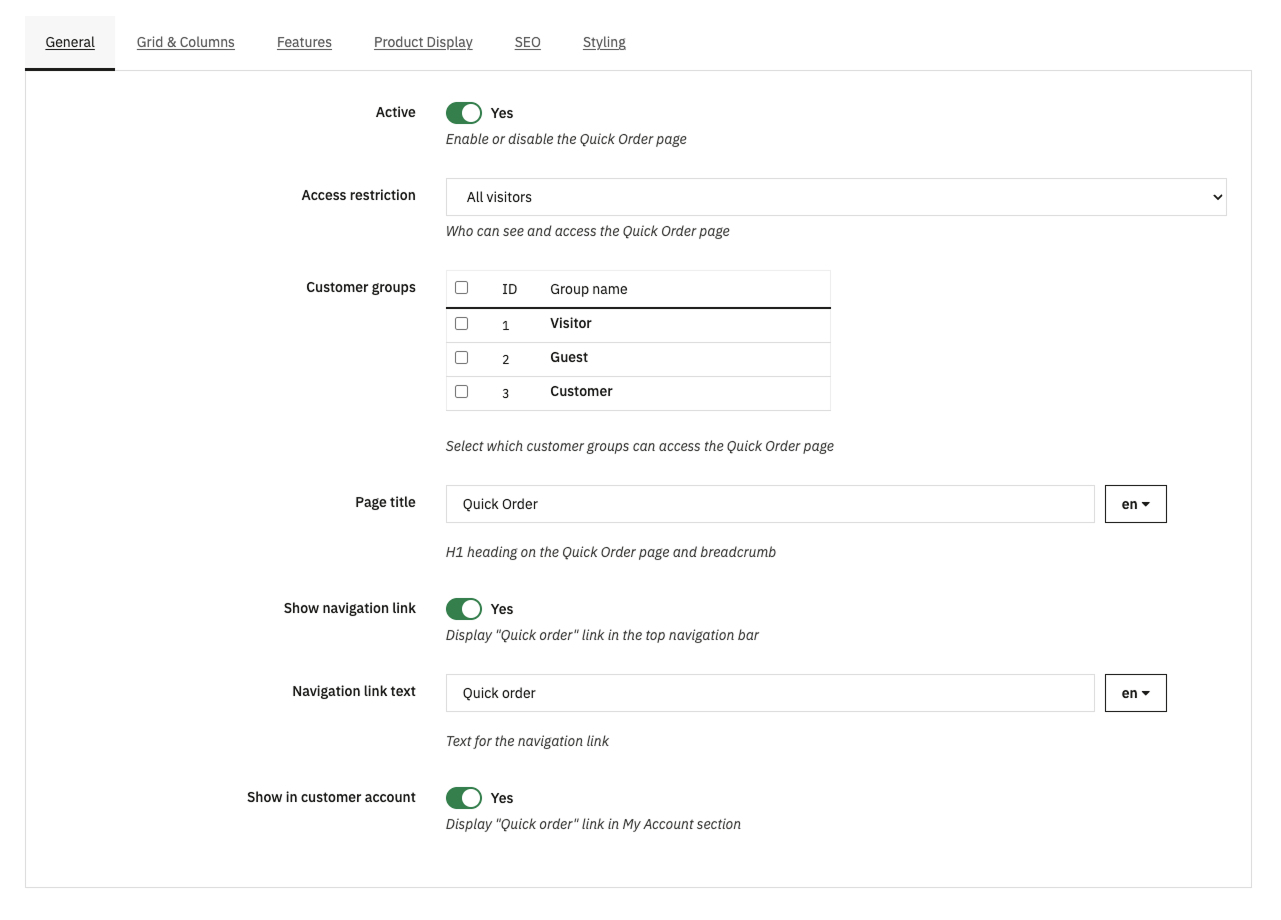
| Setting | Description | Default |
|---|---|---|
| Active | Enable or disable the Quick Order page entirely. When disabled, the page returns a 404. | On |
| Access restriction | Who can access the Quick Order page. Options: All visitors, Logged-in customers only, Selected customer groups. | All visitors |
| Customer groups | Visible only when "Selected customer groups" is chosen. Multi-select list of customer groups that have access. Non-authorized visitors are redirected to the login page. | - |
| Page title | The H1 heading displayed on the Quick Order page and in the breadcrumb. Multilingual field - set a different title for each shop language. | Quick Order |
| Show navigation link | Display a "Quick order" link in the top navigation bar (displayNav2 hook). | On |
| Navigation link text | The text for the navigation link. Multilingual field. | Quick order |
| Show in customer account | Display a "Quick order" link in the My Account section for logged-in customers. | On |
3.2 Grid & Columns
This tab contains the live Grid Configurator - a WYSIWYG editor where you visually arrange columns that your customers will see on the front page.
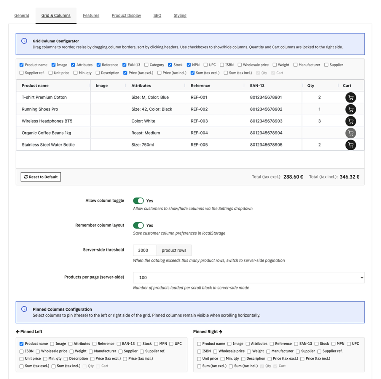
Grid Configurator
The grid preview shows 5 sample products. You can:
- Drag columns - Click and hold a column header, then drag it left or right to change the column order
- Resize columns - Hover over the border between two column headers until you see the resize cursor. Click and drag to adjust the width.
- Sort columns - Click a column header to sort. Click again to reverse. (This only affects the preview.)
- Show/Hide columns - Use the checkbox panel on the right side. Unchecking a column hides it from the grid instantly. The grid preview updates in real time.
Important: The Product Name column is always pinned to the left and cannot be hidden. The Qty and Cart columns are pinned to the right by default.
Click Save to store the column configuration. Click Reset to default to restore the original column layout.
Other Grid Settings
| Setting | Description | Default |
|---|---|---|
| Allow column toggle | Let customers show/hide columns via the Settings dropdown on the front page. | On |
| Remember customer layout | Save customer column preferences in their browser (localStorage). Their layout is restored on next visit. | On |
| Server-side threshold | When the catalog exceeds this many product rows (products + combinations), the module automatically switches to server-side pagination with infinite scroll. | 3000 |
| Products per page | Number of products loaded per scroll block in server-side mode. Options: 50, 100, 200, 500. Higher values = fewer AJAX requests but slower each load. | 100 |
3.3 Features
This tab enables or disables individual module features. Each feature adds a toolbar button or front-page element.
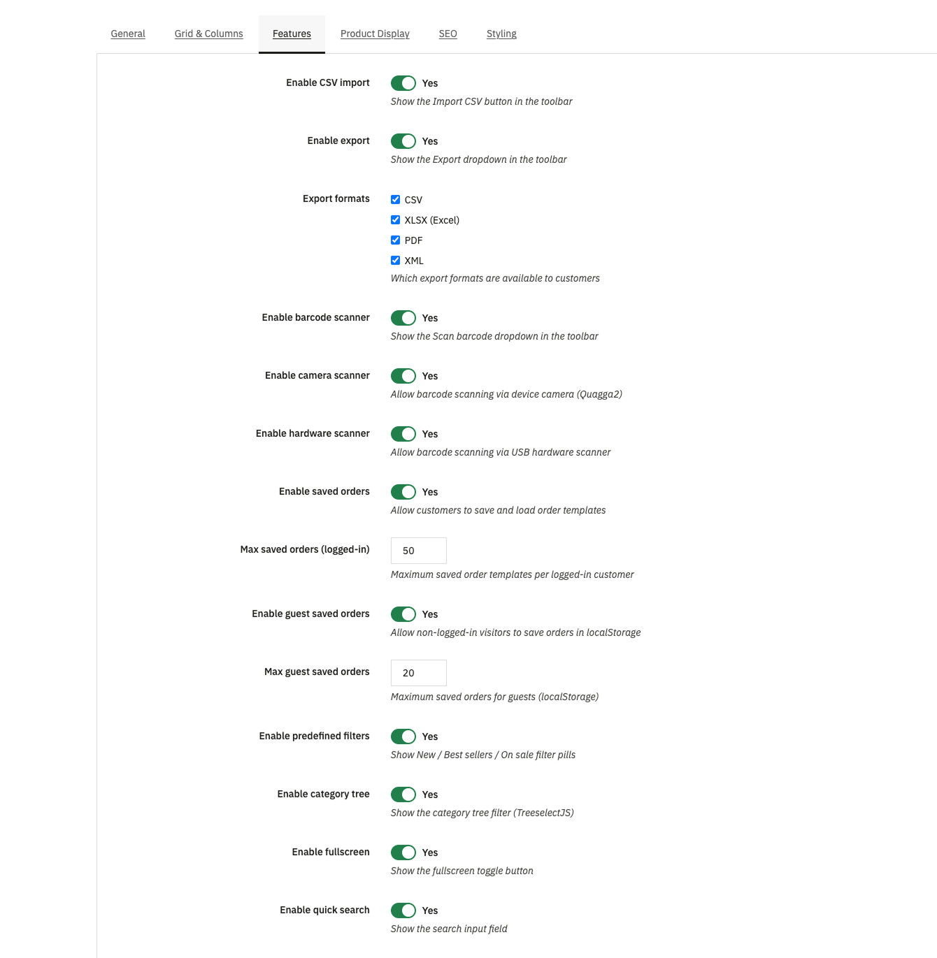
| Setting | Description | Default |
|---|---|---|
| Enable CSV import | Show the "Import CSV" and "Quick Paste" buttons in the toolbar. | On |
| Enable export | Show the "Export" dropdown in the toolbar. | On |
| Export formats | Which export formats are available. Check any combination of: CSV, XLSX, PDF, XML. | All checked |
| Enable barcode scanner | Show the "Scan barcode" dropdown in the toolbar. | On |
| Enable camera scanner | Allow barcode scanning via device camera. Requires HTTPS. | On |
| Enable hardware scanner | Allow barcode scanning via USB barcode scanner. | On |
| Enable saved orders | Allow logged-in customers to save and load order templates. | On |
| Max saved orders | Maximum number of saved order templates per logged-in customer. | 50 |
| Enable guest saved orders | Allow non-logged-in visitors to save orders in browser localStorage. | On |
| Max guest saved orders | Maximum saved orders for guests. | 20 |
| Enable predefined filters | Show the "New", "Best sellers", and "On sale" filter pills above the grid. Pills with zero results are hidden automatically. | On |
| Enable category tree | Show the category tree dropdown filter (TreeselectJS). | On |
| Enable fullscreen | Show the fullscreen toggle button in the toolbar. | On |
| Enable quick search | Show the search input field above the grid. | On |
3.4 Product Display
This tab controls how products appear in the grid - images, badges, prices, and out-of-stock behavior.
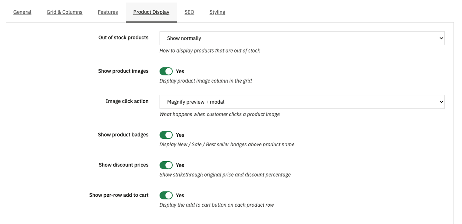
| Setting | Description | Default |
|---|---|---|
| Out-of-stock display | How to display products and combinations with zero stock. The setting applies at individual combination level - if only some combinations are out of stock, only those rows are affected. Options: Show normally (stock shows 0), Show greyed out (disabled) (row visible but qty input disabled), Hide completely (not shown in grid). | Show normally |
| Stock display mode | How stock levels are shown in the Stock column. Options: Number (exact quantity), Color indicator (green/orange/red dot based on threshold). | Number |
| Stock threshold | When using color indicator mode, stock at or below this number shows as orange (low); zero shows as red (out of stock); above shows as green (in stock). | 5 |
| Show product images | Display the product image column. | On |
| Image click action | What happens when a customer clicks a product image. Options: Magnify (hover preview + full-size modal), Product link (opens the product page), None (no interaction). | Magnify |
| Show product badges | Display colored badges above the product name: green "New", red "Sale" (with discount %), orange "Best seller". | On |
| Show discount prices | Show strikethrough original price with the discounted price in red and a percentage badge (e.g., "-20%"). | On |
| Show per-row add to cart | Display an individual add-to-cart button on each product row, in addition to the bulk "Add to cart" button at the bottom. | On |
Note: If the Enable / Disable a Combination, Import .csv module is detected, an info box appears at the top of this tab explaining how disabled combinations are handled. See Compatible Third-Party Modules for details.
3.5 SEO
This tab configures the meta tags and search engine indexing for the Quick Order page.
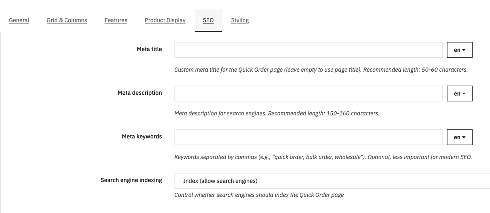
| Setting | Description | Default |
|---|---|---|
| Meta title | Custom <title> tag for the Quick Order page. Leave empty to use the page title from the General tab. Recommended: 50–60 characters. |
(empty) |
| Meta description | The <meta name="description"> tag. Shown in search engine results. Recommended: 150–160 characters. |
(empty) |
| Meta keywords | Comma-separated keywords. Optional - less important for modern SEO but still used by some search engines. | (empty) |
| Robots indexing | Control whether search engines should index this page. Options: Index (allow indexing), NoIndex (block indexing). Use NoIndex if the page is restricted to certain customer groups. | Index |
3.6 Styling
This tab lets you customize the visual appearance of the Quick Order page with custom colors and spacing.
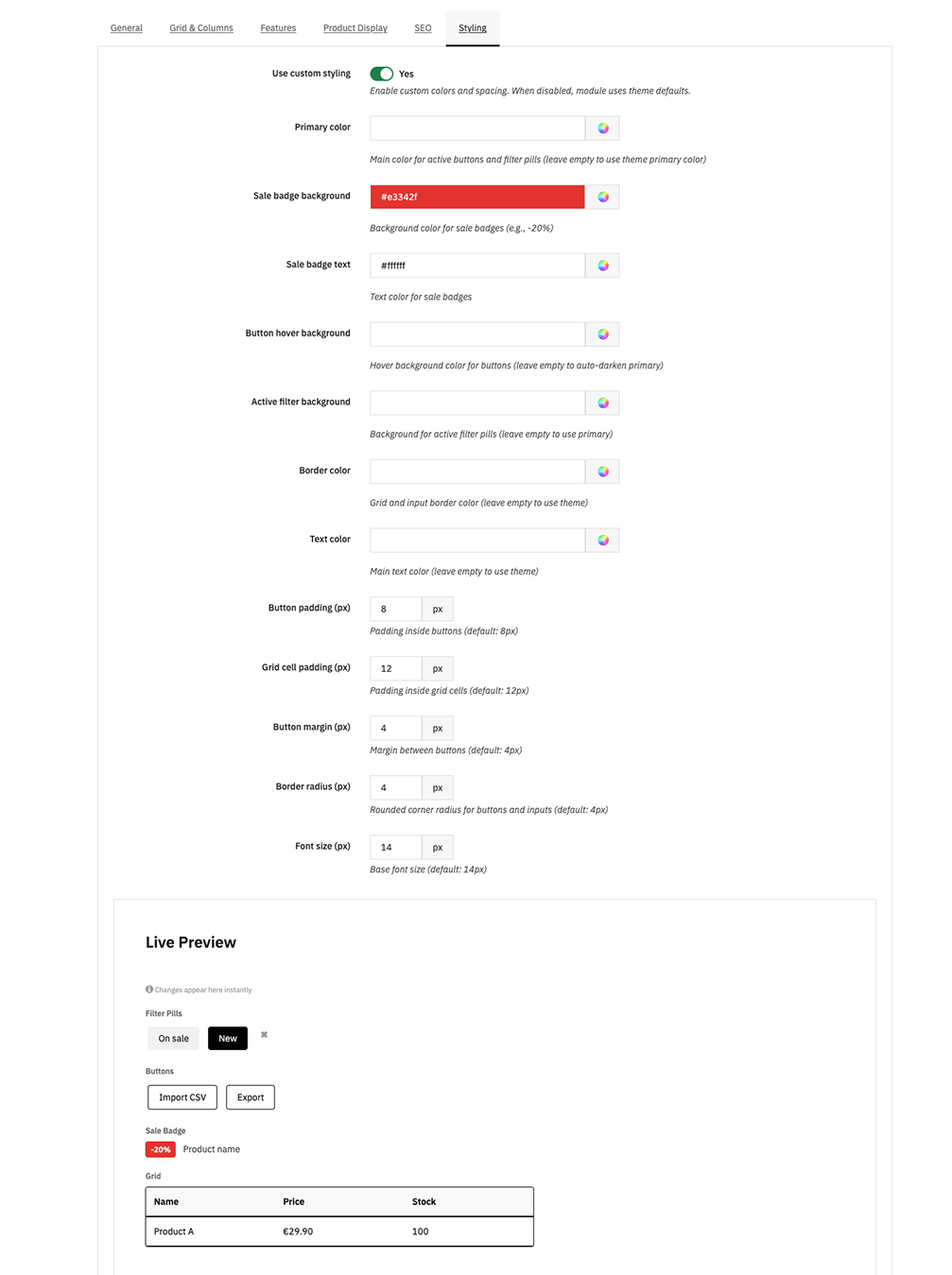
| Setting | Description | Default |
|---|---|---|
| Use custom styling | Master switch. When disabled, the module uses your theme's default colors and spacing. | Off |
| Primary color | Main color for active buttons and filter pills. Leave empty to use theme primary color. | (theme default) |
| Sale badge background | Background color for sale badges (e.g., the "-20%" tag). | #e3342f |
| Sale badge text | Text color for sale badges. | #ffffff |
| Button hover background | Hover color for buttons. Leave empty to auto-darken the primary color. | (auto) |
| Active filter background | Background for active filter pills. Leave empty to use primary color. | (auto) |
| Border color | Grid borders and input borders. Leave empty to use theme. | (theme default) |
| Text color | Main text color. Leave empty to use theme. | (theme default) |
| Button padding | Internal padding of buttons in pixels. | 8 px |
| Grid cell padding | Internal padding of grid cells in pixels. | 12 px |
| Button margin | Space between buttons in pixels. | 4 px |
| Border radius | Rounded corner radius for buttons and inputs in pixels. | 4 px |
| Font size | Base font size for the grid and toolbar in pixels. | 14 px |