4. Settings — the 5 admin tabs
All changes are tracked by the Shopify Save bar at the top of the screen — it appears the moment you have unsaved changes, with Discard and Save.
4.1 General
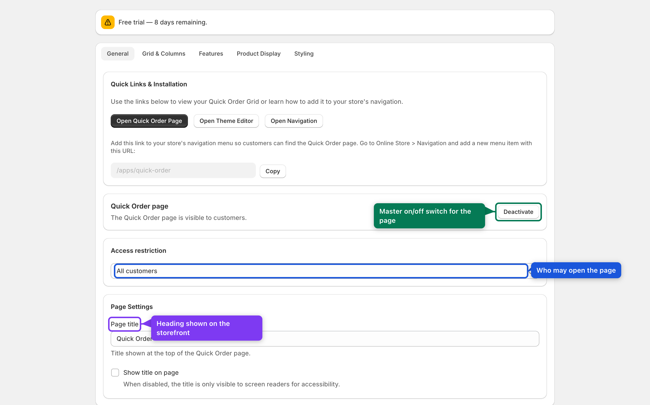
Controls the master switch, who can access the page, and the page title. The top
Quick Links & Installation card gives you three shortcuts — Open Quick Order
Page, Open Theme Editor, Open Navigation — plus a Copy button for the
page URL (/apps/quick-order).
| Setting | What it does | Default | Control |
|---|---|---|---|
| Quick Order page (Activate / Deactivate) | Master switch. When deactivated, the storefront page shows a short "This feature is currently unavailable" message and its data API returns 403. | Active | Button |
| Access restriction | Who can open the page: All customers, Logged-in customers only, or Customers with specific tags. Visitors who don't qualify see an inline access-denied panel (with a log-in link) — they are not redirected away. | All customers | Select |
| Customer tags | Shown only for the tagged option. Comma-separated Shopify customer tags that grant access (case-insensitive). | (empty) | Text |
| Page title | The heading shown on the page. | Quick Order | Text |
| Show title on page | When off, the title is still in the page for screen readers but not shown visually. | Off | Checkbox |
4.2 Grid & Columns
The heart of the app. The Grid Column Configurator is a live AG Grid preview: turn columns on/off with the checkboxes, and drag/resize/reorder them exactly as your customers will see them. Reset to Default restores the original layout.
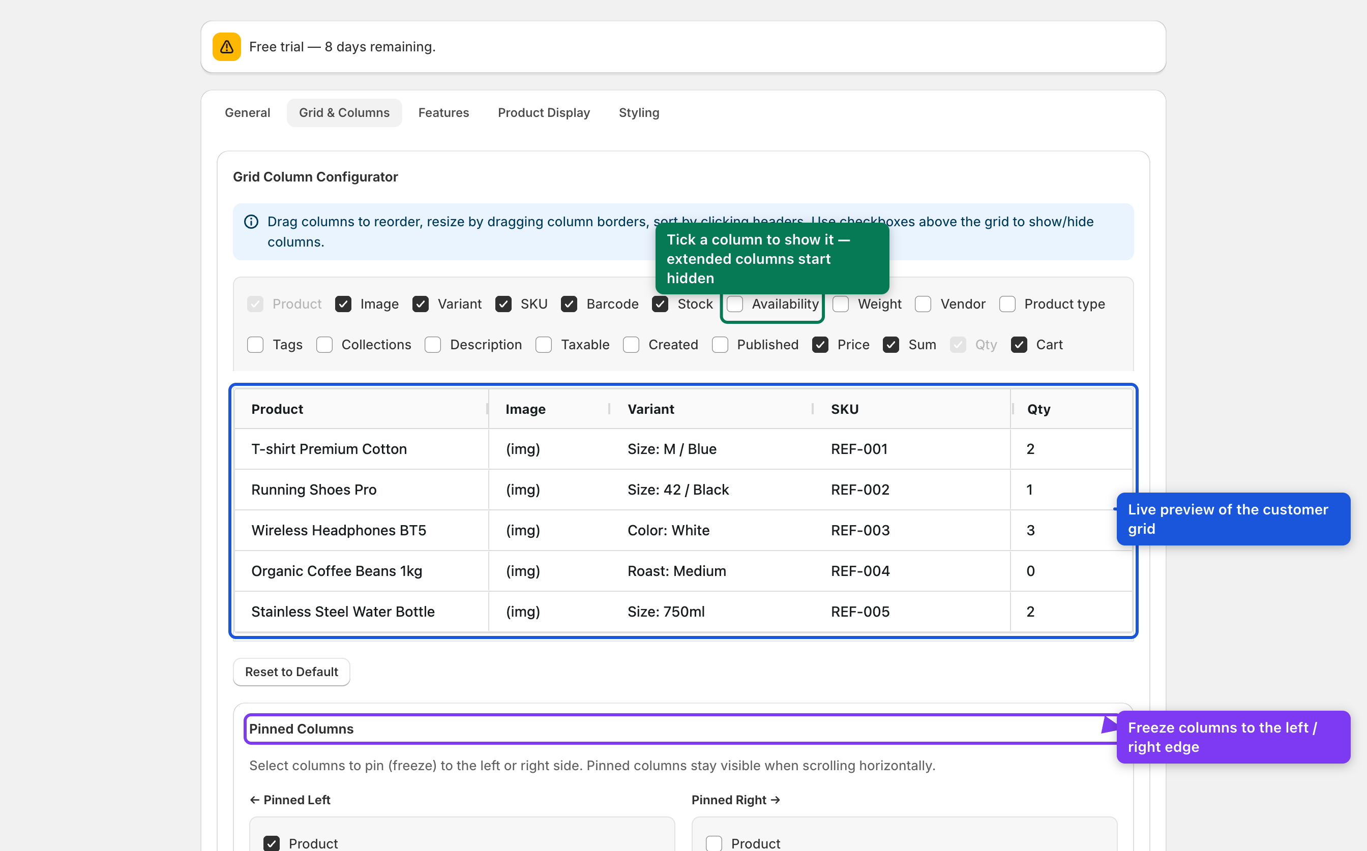
Column trimming (important): the essential columns are on by default (Product, Image, Variant, SKU, Barcode, Stock, Price, Sum, Qty, Cart). The extended columns — Availability, Weight, Vendor, Product type, Tags, Collections, Description, Taxable, Created, Published — start hidden. Their data isn't even fetched until you enable them, which keeps the page fast. Tick a column here to switch it on.
- Product is always the first column and can't be hidden. Qty (and the Cart action) are pinned to the right.
Grid Options
| Setting | What it does | Default |
|---|---|---|
| Allow column toggle | Let customers show/hide columns from the storefront Settings gear. | On |
| Remember layout | Save each customer's column arrangement so it's restored on their next visit. | On |
Pinned Columns
Freeze columns to the left or right edge so they stay visible while scrolling horizontally. Defaults: Pinned left = Product; Pinned right = Qty + Cart.
Custom Metafields
Click Add metafield column and pick any product metafield definition to show it as a grid column with a label you choose. See Section 16.
Performance is automatic. There is no threshold to tune. The grid runs client-side (everything loaded up front, instant sort/search) for catalogs up to ~50,000 variants and switches to server-side paging automatically above that. The old "server-side threshold" control has been removed.
4.3 Features
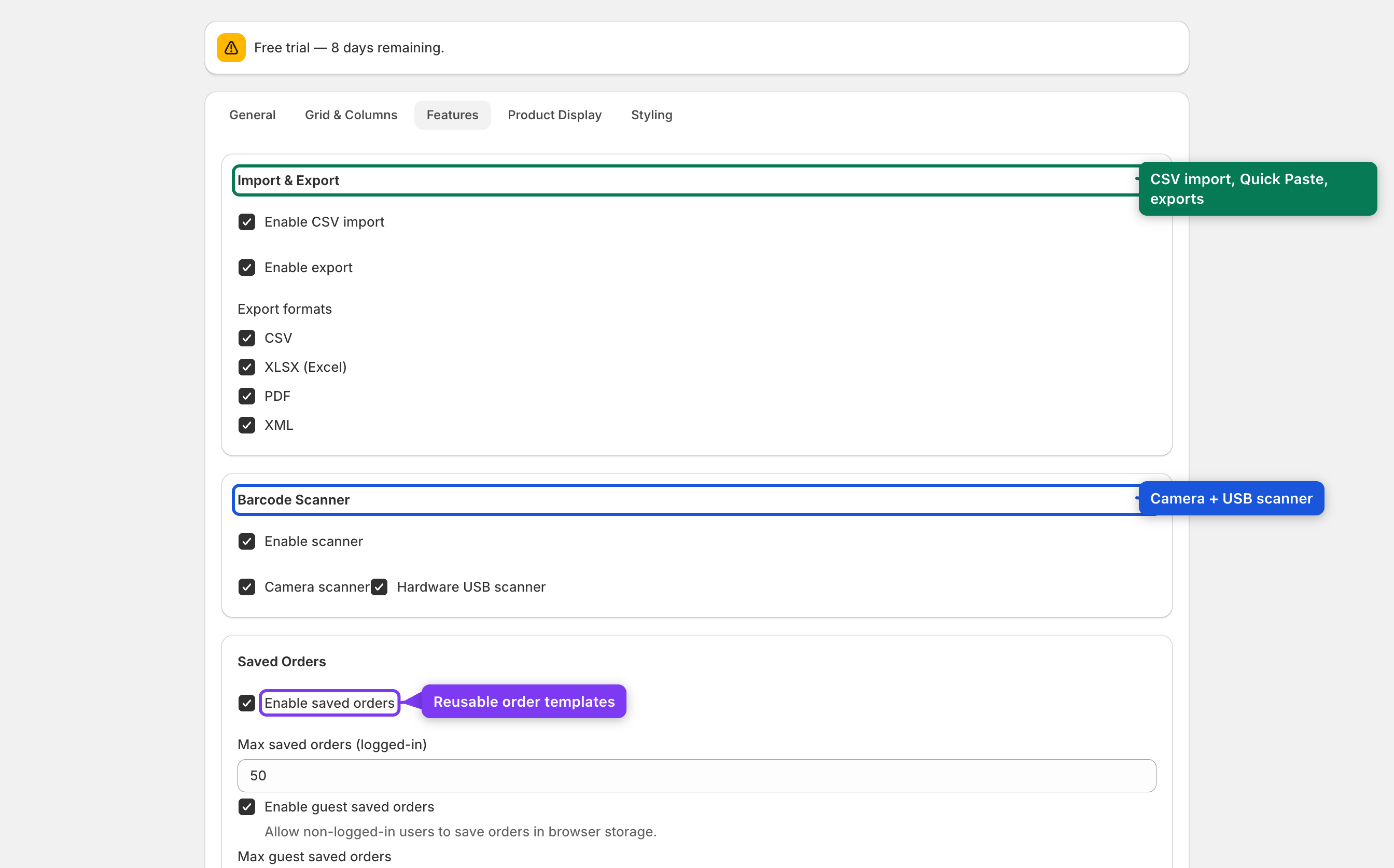
Turn individual storefront features on or off. Each one adds a toolbar button or page element.
| Setting | What it does | Default |
|---|---|---|
| Enable CSV import | Shows Import CSV and Quick Paste in the toolbar. | On |
| Enable export | Shows the Export dropdown. | On |
| Export formats | Which formats to offer: CSV, XLSX (Excel), PDF, XML. | All |
| Enable scanner | Master switch for the Scan barcode button. | On |
| Camera scanner | Scan with the device camera. | On |
| Hardware USB scanner | Scan with any keyboard-emulating USB/Bluetooth scanner. | On |
| Enable saved orders | Shows Save order and Saved orders. | On |
| Max saved orders (logged-in) | Per-customer limit (stored in the database). | 50 |
| Enable guest saved orders | Let non-logged-in visitors save orders in their browser. | On |
| Max guest saved orders | Per-browser limit (localStorage). | 20 |
| Predefined filters | Show the New / On sale quick-filter pills. | On |
| Collection filter | Show the collections tree dropdown. | On |
| Fullscreen mode | Show the fullscreen toggle. | On |
| Search | Show the search box. | On |
4.4 Product Display
Controls how products look in the grid — stock behaviour, images, badges, and the optional B2B VAT display.

| Setting | What it does | Default |
|---|---|---|
| Out of stock products | Show (orderable if the inventory policy allows), Hide, or Show greyed out (visible but not orderable). | Show |
| Show product images | Show the image column. | On |
| Image click action | Magnify on hover, Open in modal, or No action. | Magnify |
| Show badges | Coloured New, Sale and Bestseller badges on the product name. | On |
| Show discount prices | Show the struck-through original price next to the sale price. | On |
VAT price display (B2B)
This card turns on net + gross pricing for B2B buyers — see Section 17 for the full walkthrough.
- Show net + gross (incl. VAT) prices — off by default. When on, the price column splits into Price excl. VAT, Price incl. VAT and a VAT column, shown only to logged-in buyers who belong to a B2B company. Guests and regular retail customers keep a single price. The checkout price is always authoritative.
- Prominent price — which price to emphasise (Automatic / incl. VAT / excl. VAT).
- Label tax-exempt / reverse-charge buyers, and an optional disclaimer line.
- The first time you enable it, a banner asks you to Grant access — this triggers
the one-time
write_draft_orderspermission request. The app uses it only to read the correct tax rate from Shopify.
4.5 Styling
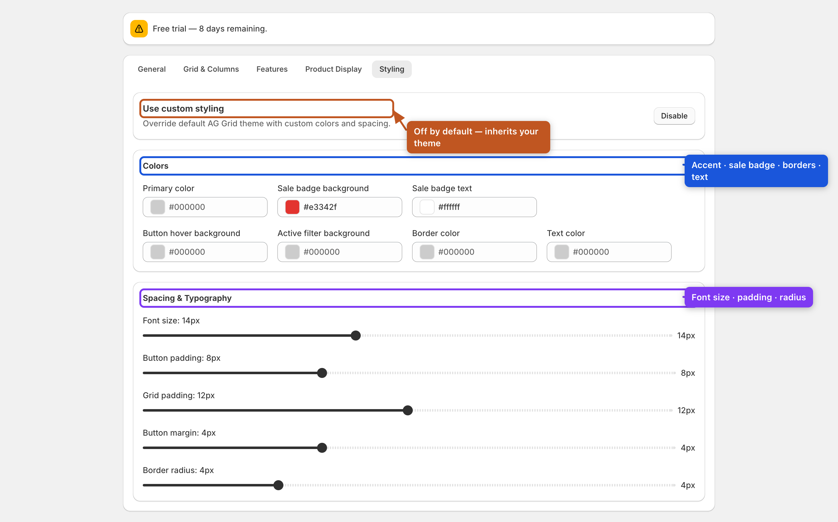
By default the app inherits your theme's look. Turn on Use custom styling to reveal the colour and spacing controls.
| Setting | Default |
|---|---|
| Use custom styling (master toggle) | Off |
| Primary colour / Button hover / Active filter / Border / Text colour | (theme default) |
| Sale badge background | #e3342f |
| Sale badge text | #ffffff |
| Font size | 14 px |
| Button padding | 8 px |
| Grid padding | 12 px |
| Button margin | 4 px |
| Border radius | 4 px |
Colours use a swatch + colour picker; spacing uses sliders that show the current value.