13. Display settings
Click Settings in the navigation at the top of the module. These settings apply to all campaigns. Change the values, then click Save settings (or Discard changes to go back).
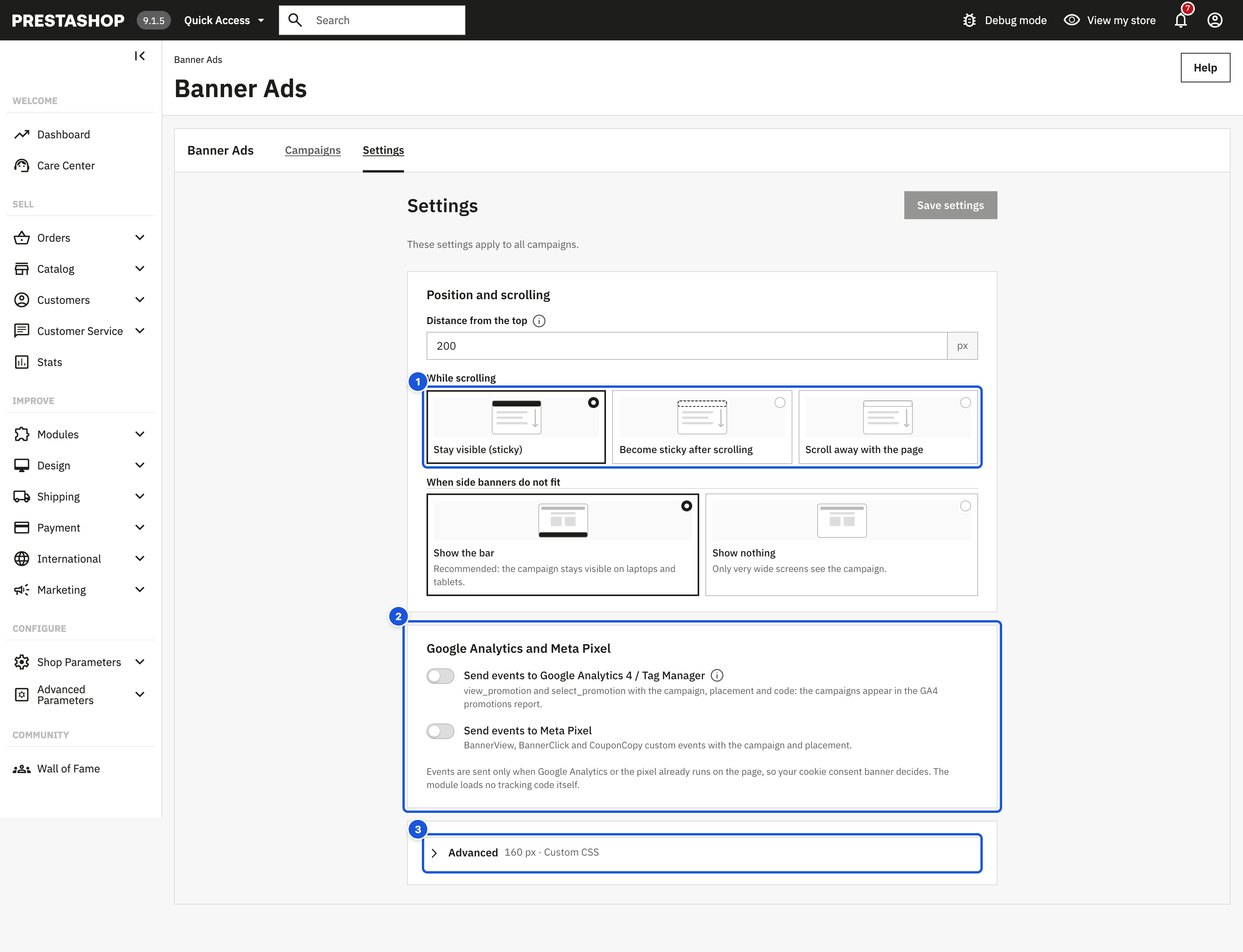
- While scrolling, shown as pictures
- Google Analytics and Meta Pixel
- Advanced: widths, page cache, theme container, CSS
In a multistore installation the settings follow the PrestaShop shop context, like other module settings: select a shop in the shop selector at the top of the back office to give it its own values, or All shops to change the shared values.
Tip: keep the campaign editor open in another browser tab and check the preview after saving.
The page has three parts:
- Position and scrolling – what most stores adjust: Distance from the top, While scrolling (three pictures show the behaviour) and When side banners do not fit.
- Google Analytics and Meta Pixel – see Advanced settings.
- Advanced (collapsed; the header lists the current values) – the width of the side banners, the distance of the bar from the bottom on phones, Page cache, the theme container, custom CSS and one-page checkout modules. It opens by itself when a value there needs fixing.
The sections below describe every setting.
Side banners
| Setting | Allowed values | Default | What it does |
|---|---|---|---|
| Width | 80 – 400 px | 160 px | Width of the left and right banner. 160 px is the standard width; wider themes can use more. |
| Show from a window width of | 768 – 3840 px | 1460 px | Below this window width the bar is used. The banners also appear only when they fit next to your content. |
| Distance from the top | 0 – 1000 px | 200 px | Space above the side banners, for your header. |
| While scrolling | see below | Stay visible (sticky) | How the side banners behave when the shopper scrolls. |
| Sticky after | 0 – 5000 px | 100 px | Only for Become sticky after scrolling: how far the banners scroll with the page before they stay in place. |
While scrolling options:
| Option | Behaviour |
|---|---|
| Stay visible (sticky) | The banners start below your header at the Distance from the top and rise with the page as the shopper scrolls, until they are 20 px from the top of the window. There they stay. |
| Become sticky after scrolling | The banners scroll away with the page for the first Sticky after pixels, then stay in place (never closer than 20 px to the top of the window, and never under a sticky theme header). A value larger than the room between Distance from the top and the top of the window makes the banners reach the top first, so they behave like Stay visible: for example with 200 px from the top, use less than about 180 px. |
| Scroll away with the page | The banners scroll away with the page like normal content. |
The side banners always stop above your footer, so they never cover it. If your theme has a header that stays on screen while scrolling (for example Hummingbird), the side banners stop below it instead of sliding under it.
When do the side banners appear?
Both conditions must be true:
- The browser window is at least as wide as Show from a window width of.
- The free space next to your theme content is at least the banner Width plus a small margin. The module measures this on every page and whenever the window is resized.
The banners are placed next to your content, not glued to the edge of the screen.
Bar on phones and narrow screens
| Setting | Allowed values | Default | What it does |
|---|---|---|---|
| When side banners do not fit | see below | Show the bar | What wide-screen shoppers see when the side banners do not fit. |
| Distance from the bottom on phones | 0 – 300 px | 0 px | If your theme keeps an "Add to cart" button at the bottom of phone screens, enter its height so the bar sits above it. |
When side banners do not fit:
| Option | Behaviour |
|---|---|
| Show the bar | Recommended: the campaign stays visible on laptops and tablets. |
| Show nothing | Only very wide screens see the campaign. |
On phones (window narrower than 768 px) the bar is always used, whatever you choose here.
A bar at the Bottom spans the full width of the screen. On computers its content is kept in one row, up to about 1120 px wide: texts on the left, countdown and discount code on the right. A bar at the Top is part of the page above your theme header and always spans the full width; it scrolls away with the page and never covers your logo, menu or cart.
A bar at the bottom of the screen never hides the end of your page: the module adds space below the page content so the last links and buttons stay reachable. The bar image is at most 160 px high and never taller than a quarter of the screen.
Which placement does a shopper see?
| Window | Side banners fit? | Shopper sees |
|---|---|---|
| Phone (under 768 px) | – | The bar |
| Wider than Show from a window width of | Yes | Left and right banners |
| Wider than Show from a window width of | No | The bar, or nothing with Show nothing |
| Between 768 px and Show from a window width of | No | The bar, or nothing with Show nothing |
This assumes the campaign has both side banners and the bar switched on. A campaign with only side banners shows nothing where they do not fit. A campaign with only the bar shows it on phones, and on computers and tablets when Also on computers and tablets is ticked in the campaign (see Content).
Errors
If a value is outside the allowed range, the field shows the range (for example "Enter 80 to 400 px.") and the settings are not saved.