14. Advanced settings
The Advanced section of Settings is meant for theme developers and shop owners comfortable with CSS. Most stores never need it.
Content container of the theme
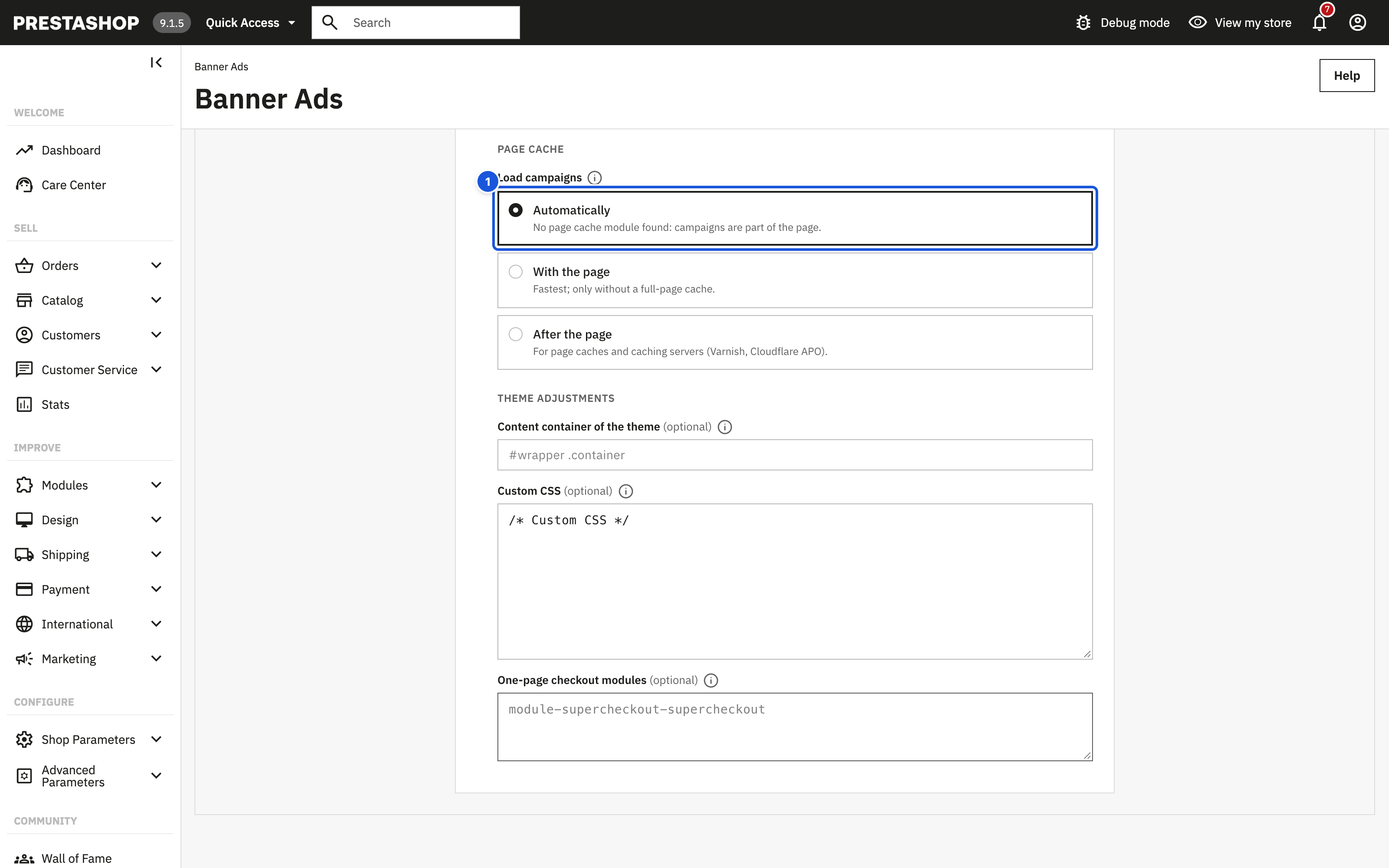
Content container of the theme (optional) is the CSS selector of the main content column of your theme, for example #wrapper .container. Only fill it in if the banners overlap your content. The module finds the container automatically in most themes: it uses the widest visible Bootstrap container (.container, .container-lg, .container-xl and so on) that is narrower than the window. If no container is found, the side banners are shown whenever the window is wide enough.
The storefront script measures the left edge of this element to decide whether the side banners fit (the free space must be at least the banner width plus 16 px) and to position them next to the content.
Allowed characters: letters, digits, spaces and # . > : - _ [ ] = " ' ,, up to 200 characters. Otherwise the field shows "Use a simple CSS selector, e.g. #wrapper .container."
How to find the selector:
- Open your store in Chrome or Firefox and right-click the edge of the main content, then Inspect.
- Look for the element that holds the page content and has a fixed maximum width (often
.containerinside#wrapper,mainor#content-wrapper). - Enter its selector, save and check the preview on Wide screen and Laptop.
Custom CSS
Custom CSS (optional) is added to every page that shows a campaign (and to the editor preview); pages without a campaign do not load it. Up to 20,000 characters; <style> and <script> tags are removed.
Prefer the editor where possible: colours, font, rounding and entrance are set per campaign in the Design tab, widths and positions in Display settings.
Storefront structure
<div id="sab-campaign" class="sab-root sab-anim-fade sab-has-close" data-mode="sides|bar|none">
  <aside class="sab-side sab-side--left sab-mode-design fancy-baner-left" data-place="left">…</aside>
  <aside class="sab-side sab-side--right sab-mode-image fancy-baner-right" data-place="right">…</aside>
  <div id="mobile-ad-banner-wrapper" class="sab-bar sab-bar--bottom sab-mode-design" data-place="mobile">…</div>
</div>
| Selector | Element |
|---|---|
#sab-campaign, .sab-root |
Wrapper of the campaign. data-mode tells which placement is shown: sides, bar or none. |
.sab-side, .sab-side--left, .sab-side--right |
Side banners (fixed position). |
.sab-bar, .sab-bar--top, .sab-bar--bottom |
The bar. .sab-bar--top sits in the page flow above the header (full width); .sab-bar--bottom is fixed to the screen. |
.sab-mode-design, .sab-mode-image |
Content type of a placement. |
.sab-card, .sab-card--side, .sab-card--bar |
Designed banner. |
.sab-card__title, .sab-card__sub |
Headline and supporting text. |
.sab-cta |
Button. |
.sab-coupon, .sab-coupon__code |
Discount code button. |
.sab-countdown, .sab-countdown--cards, .sab-countdown--text |
Countdown; .sab-countdown__unit, __value, __name, __label inside. |
.sab-media, .sab-media__img, .sab-media__link |
Own-image banner. |
.sab-close |
Close button. |
.fancy-baner-left, .fancy-baner-right, #mobile-ad-banner-wrapper |
Kept for compatibility with 2.x custom CSS. |
CSS custom properties
The campaign colours and sizes are set as CSS custom properties on #sab-campaign. You can read or override them:
| Property | Value |
|---|---|
--sab-bg, --sab-bg-solid |
Background (one colour or the gradient) and a plain colour (the first gradient point) |
--sab-pattern, --sab-pattern-opacity |
Background pattern and its strength (0.05–1; drawn on the card's ::before layer) |
--sab-pattern-img, --sab-pattern-size |
Own pattern: the tile image and its width (with the root class sab-pattern-custom) |
--sab-fg, --sab-sub |
Headline and supporting text colour |
--sab-accent, --sab-accent-fg |
Button colour and button text colour |
--sab-radius |
Corner rounding |
--sab-font |
Font stack |
--sab-side-w, --sab-top |
Side banner width, distance from the top |
--sab-cd-bg, --sab-cd-fg |
Countdown strip colours on image banners (by default the design background at 88 % opacity and the headline colour) |
Examples
Raise the banners above a sticky header of your theme:
#sab-campaign .sab-side,
#sab-campaign .sab-bar {
  z-index: 1100;
}
Change the countdown strip over images:
#sab-campaign {
  --sab-cd-bg: rgba(200, 16, 46, 0.9);
  --sab-cd-fg: #ffffff;
}
Uppercase headline on designed banners:
#sab-campaign .sab-card__title {
  text-transform: uppercase;
}
Keep the side banners hidden while you test only the bar:
#sab-campaign .sab-side {
  display: none !important;
}
Notes
- Do not change
displayorpositionof.sab-sideand.sab-barin normal use: the storefront script shows and positions them after measuring the page. - The banners use
position: fixed. A theme that setstransformorfilteronbodybreaks fixed positioning. - Campaign assets (
front.css,front.js) and the custom CSS are loaded only on pages that show a campaign.
Theme position (hook)
The module prints the campaign once per page through displayAfterBodyOpeningTag (right after the opening <body> tag), with displayBanner and displayBeforeBodyClosingTag as fallbacks. It loads its assets through displayHeader. Check them in Design > Positions if no campaign appears. The banners are positioned by the script, so the place of the hook inside the theme does not matter, only that the theme outputs at least one of them. Classic's checkout, which has no displayBanner, shows campaigns through displayAfterBodyOpeningTag.
Google Analytics and Meta Pixel
Settings > Google Analytics and Meta Pixel sends campaign events to the tools your store already uses:
| Switch | Events |
|---|---|
| Send events to Google Analytics 4 / Tag Manager | view_promotion when a banner is seen, select_promotion on a click (with promotion_id sab-<campaign ID>, promotion_name = campaign name, creative_slot = left, right or mobile), sab_coupon_copy when a code is copied. They fill the Promotions report of GA4 (Monetisation > E-commerce) and link banners to purchases. With Google Tag Manager the events go to the dataLayer under ecommerce. |
| Send events to Meta Pixel | Custom events BannerView, BannerClick, CouponCopy with the campaign, its ID and the placement. |
Events are sent only when gtag, dataLayer or fbq already exist on the page: the module loads no tracking code, so your cookie consent decides. No UTM parameters are added to your own links – on internal links they would start a new visit in Google Analytics and hide where your sales came from.
One-page checkout modules
If a module replaces the checkout, enter its page as module-<module>-<controller>, one per line, e.g. module-supercheckout-supercheckout. The page then counts as Checkout in the page rules (for example "All pages except Checkout"). You find the value in the address of the checkout page (fc=module&module=…&controller=…) or ask the module's author.
Page cache
Full-page cache modules (JPresta Page Cache, LiteSpeed Cache and similar) and caching servers (Varnish, Cloudflare APO) store whole pages and serve the same copy to many shoppers. A campaign printed into such a page would show the same to everyone – including campaigns meant for a customer group, a cart value or a country – and would stay on the page after its end date.
Settings > Advanced > Page cache > Load campaigns:
| Option | Behaviour |
|---|---|
| Automatically (default) | When an enabled JPresta or LiteSpeed cache module is found, campaigns load after the page; otherwise with the page. The option says which case applies. |
| With the page | The campaign is part of the page HTML. Fastest; only without a full-page cache. |
| After the page | The cached page keeps only an empty placeholder; right after loading, the storefront asks the module for the campaign of the current shopper (groups, cart, country, device, time). Choose it for caching servers the module cannot detect. |
If a page cache module is found but With the page is selected, the settings page shows a warning.