4. Editor: Content
The campaign editor fills the back-office page below the PrestaShop header, next to the menu; Campaigns at its top left takes you back to the list. The ⤢ button in the editor header switches to full screen (Esc or the same button returns); the ? button replays a short tour of the editor, which also opens once on your first visit. It has four tabs on the left – Content, Design, Where & who and When – and the live preview of your store on the right.
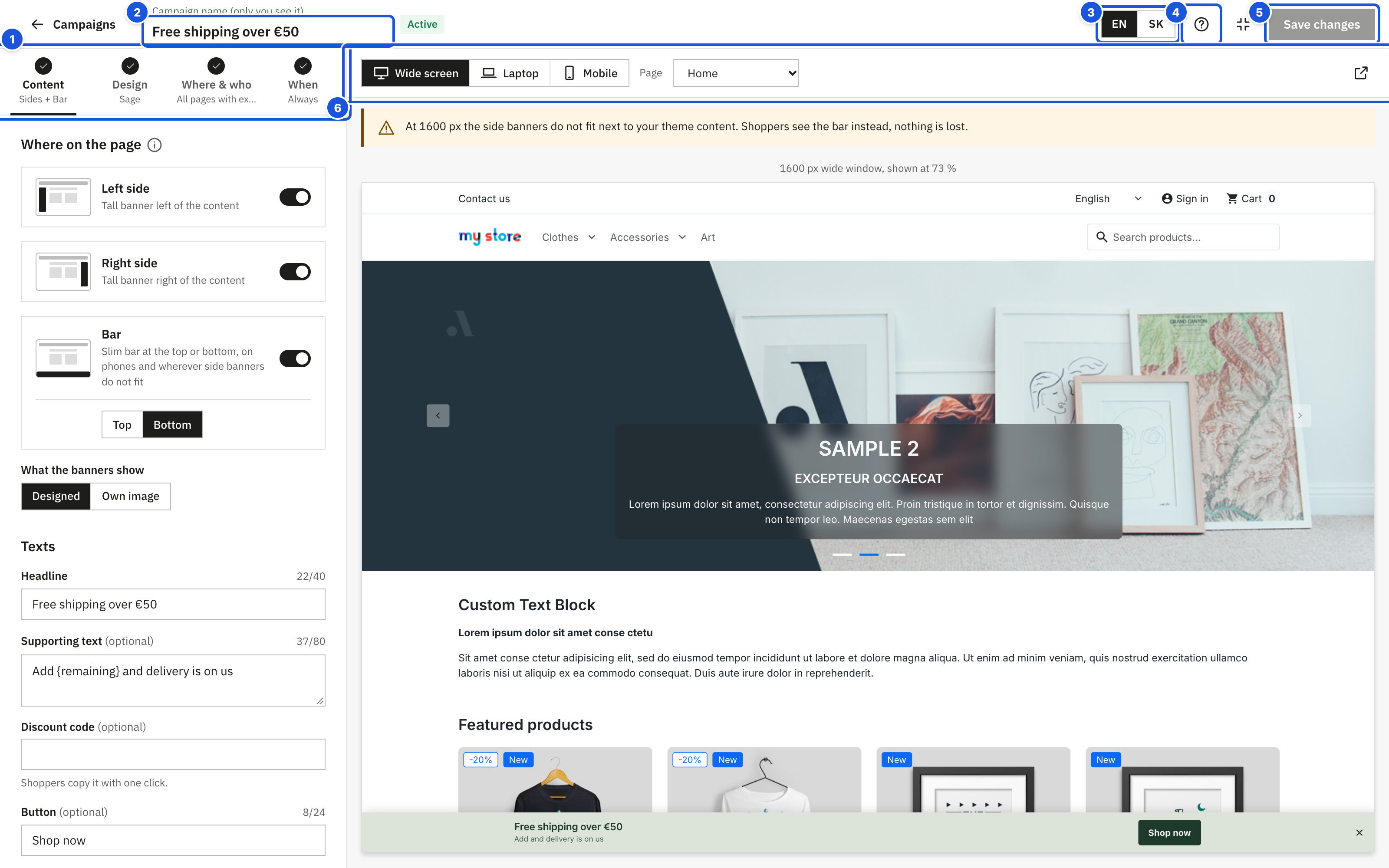
- The four steps with ✓ and a one-line summary
- Campaign name (only you see it)
- Language of the texts
- Tour (?) and full screen
- Save changes / Review and publish
- Preview: device and page
At the top of the editor you find:
- Campaigns – back to the campaign list. If you have unsaved changes, the editor asks Leave without saving? first.
- Campaign name (only you see it) – the internal name shown in the campaign list. Shoppers never see it.
- The status of the campaign: Draft, Active or Paused.
- Next to the buttons, the save status in grey text: Unsaved changes, Saving… or All changes saved.
- Language of the texts – the language you are editing (only in stores with more than one language).
- The buttons Discard changes, Save draft and Review and publish (or Save changes for a published campaign). See Review and publish.
The four tabs work as steps. Each shows a number in a circle, a check mark ✓ when the step is fine, or a red ! when something needs fixing, and under its name a one-line summary of what is set (for example Sides + Bar, Graphite, All pages, Always). You see the whole campaign at a glance without opening every tab.
Options that most campaigns never change are collapsed under More options (or a similar heading). When collapsed, the heading lists what you changed there, so nothing is hidden without a trace. The ⓘ buttons next to many settings open a short explanation.
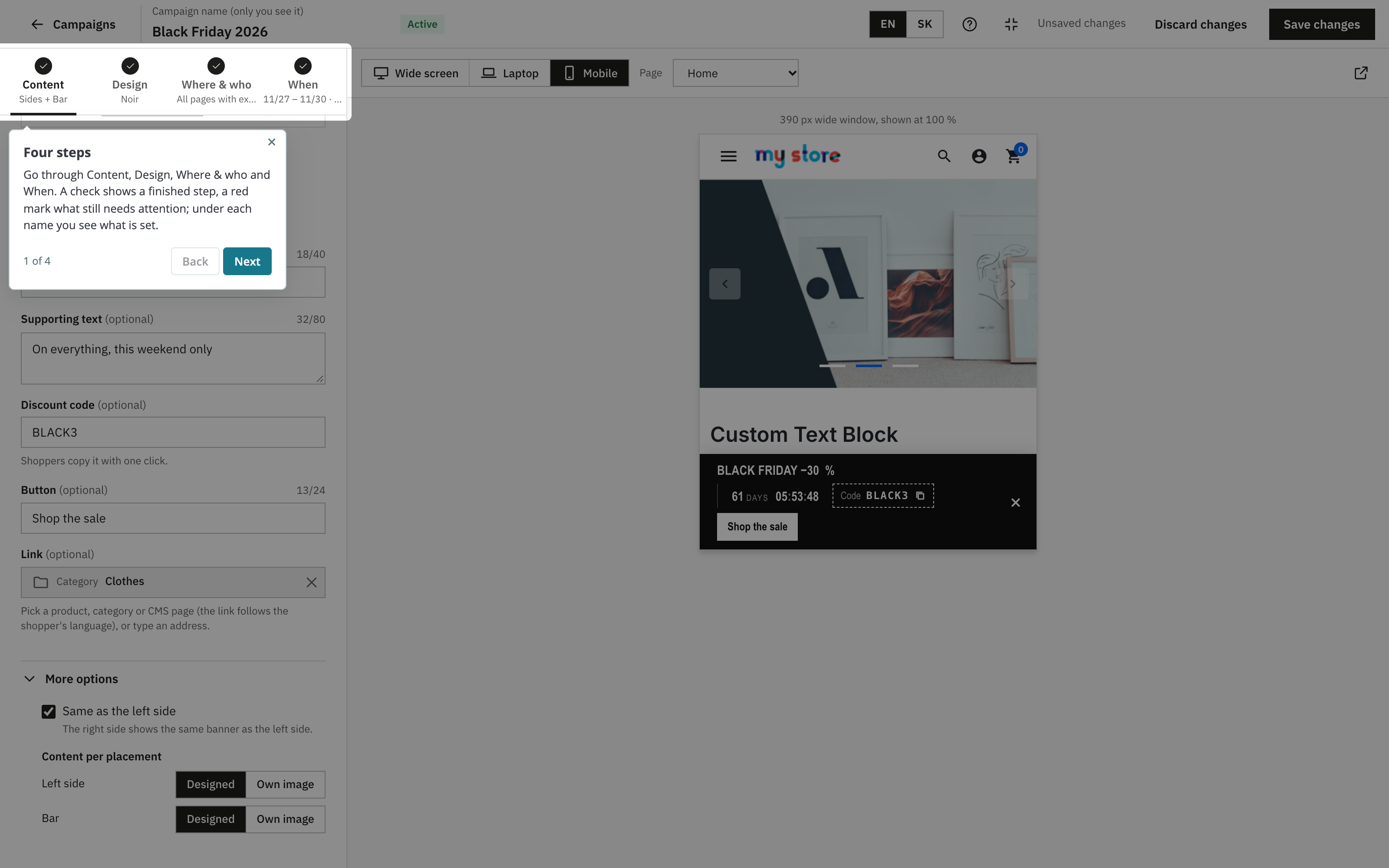
Where on the page
Each campaign has three placements. Switch on the ones you want.
| Placement | What shoppers see |
|---|---|
| Left side | Tall banner left of the content |
| Right side | Tall banner right of the content |
| Bar | Slim bar at the top or bottom, on phones and wherever side banners do not fit |
Side banners appear on wide screens next to your content, the bar on phones and narrow screens. When is the bar shown?
- Phones always get the bar.
- Campaign with side banners: on larger screens the bar appears only where the side banners do not fit, and only when When side banners do not fit is set to Show the bar in Display settings.
- Campaign without side banners: the bar follows Also on computers and tablets.
Tip: keep the bar switched on, otherwise laptop and phone users may see nothing.
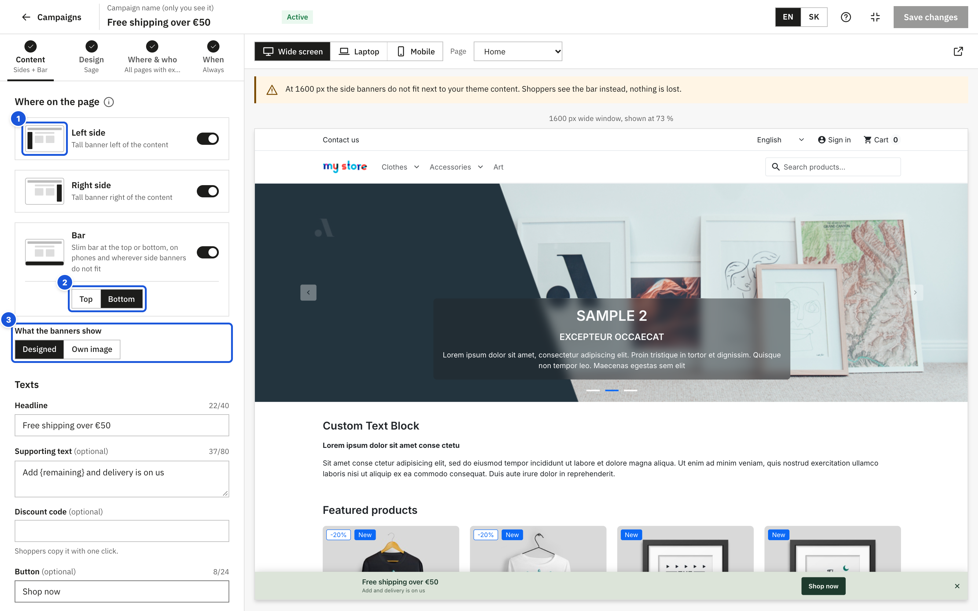
- A placement with a picture of its position and a switch
- Top or Bottom for the bar
- What the banners show: Designed or Own image
Each placement card shows a small picture of the page with the banner's position. For the Bar choose Top or Bottom:
- Top: the bar becomes part of the page above your theme header, across the full width. It never covers the logo, menu or cart, and scrolls away with the page.
- Bottom: the bar stays fixed at the bottom of the screen. The module adds space below the page so nothing is hidden behind it.
Under the cards, What the banners show chooses the content for all placements at once:
- Designed – a banner built from your texts and colours.
- Own image – an image you upload.
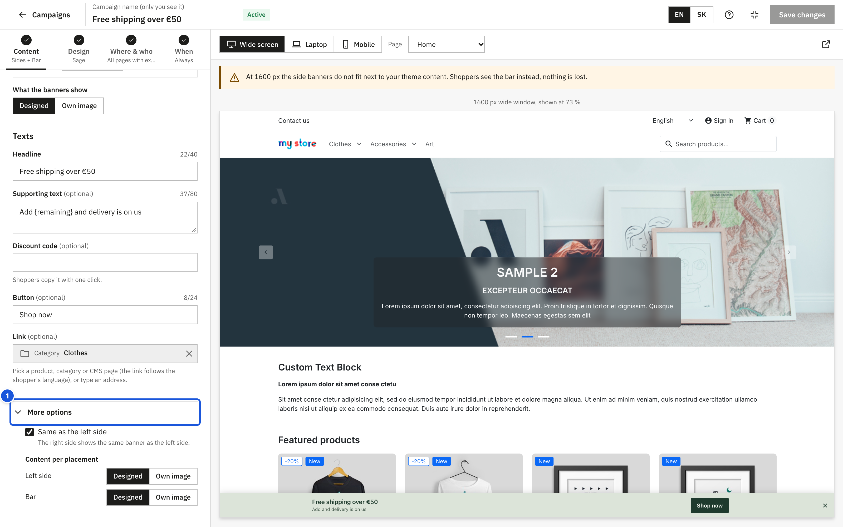
More options (collapsed) holds what few campaigns need:
- Same as the left side (when both sides are on, ticked by default): the right banner shows exactly the same as the left one, so you edit the content once. Untick it to give the right side its own content.
- Content per placement: a different content type for each placement, for example designed side banners and an image in the bar. What the banners show then says the placements are mixed.
- Also on computers and tablets (bar only, when both side banners are off): the campaign has no side banners, so the bar can run as an announcement bar on every screen. Untick it to keep the bar on phones only. It is on for new campaigns.
Clicking a placement card also highlights that banner in the preview, and clicking a banner in the preview selects its card.
Texts
The Texts section appears when at least one placement uses Designed. The texts apply to all designed placements, in the language selected at the top. No field is required on its own: a designed banner needs at least one of the headline, supporting text, discount code, button or a running countdown.
| Field | Notes |
|---|---|
| Headline | Keep it short: a counter warns above 40 characters. Example: "Black Friday −30 %". You can type a normal hyphen: the store shows "-30 %" with a real minus sign and keeps the % sign on the same line as the number. |
| Supporting text (optional) | One line of detail. A counter warns above 80 characters. |
| Discount code (optional) | Shoppers copy it with one click. Letters are turned to capitals, accented letters are kept; spaces, angle brackets, curly braces, quotes and backticks are removed automatically. Create the matching cart rule in Catalog > Discounts; the module does not create it. |
| Button (optional) | Text of the button, for example "Shop now". A counter warns above 24 characters. |
| Link (optional) | Where the banner leads. See Links below. |
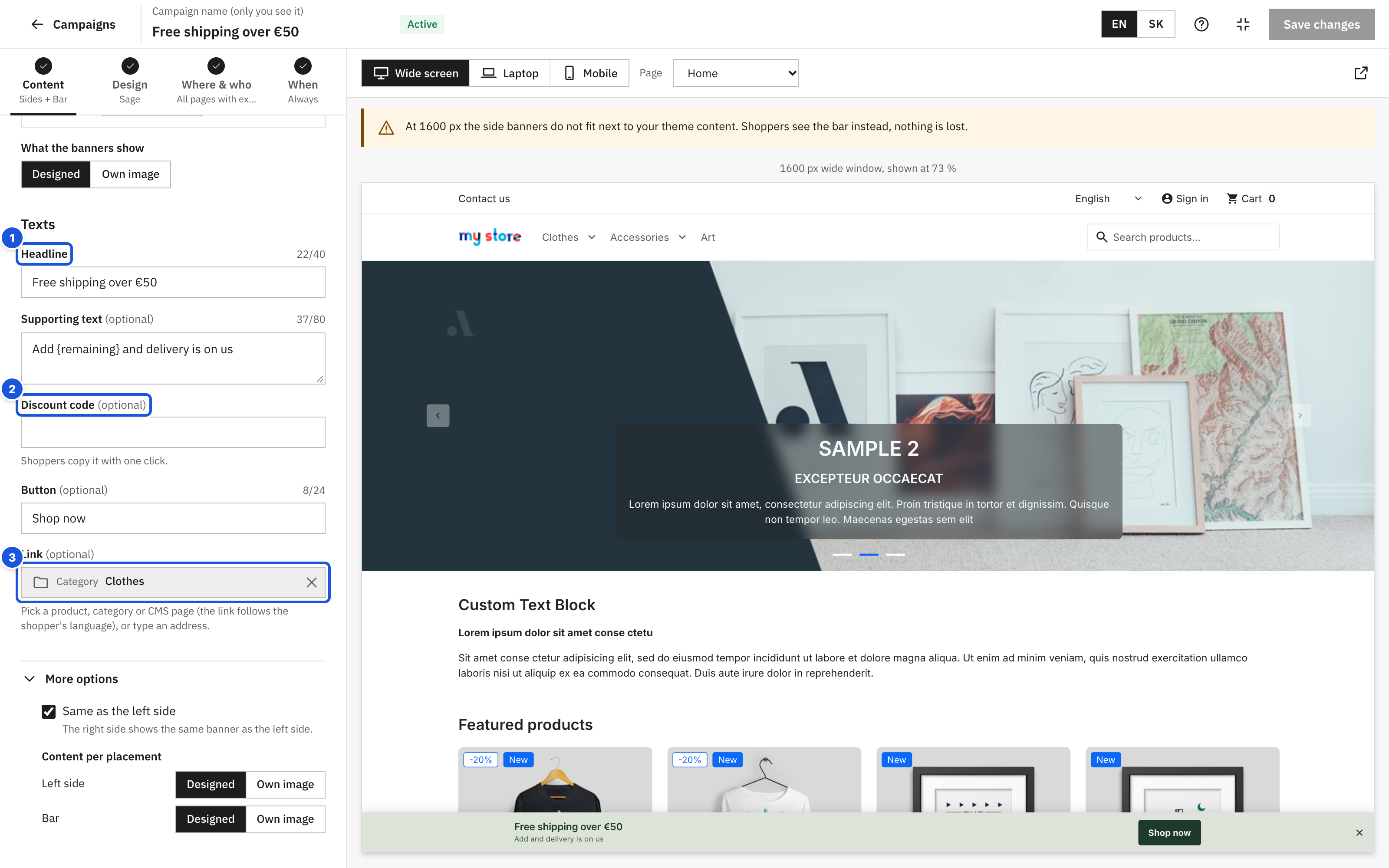
- Headline with a character counter
- Discount code
- Link to a page of your store
How the button behaves:
- Button text and link: a clickable button with your text.
- Link but no button text: a clickable button with the text "Shop now" (translated with your store).
- Button text but no link: the text is shown as a label, not clickable.
Images
The Images section appears when at least one placement uses Own image. Each placement has its own image, per language.
- Drop an image on the field or click it to choose a file (Drop an image here or click to choose). You can also click Choose from the library to reuse an uploaded image.
- Fill in Description for screen readers: describe what the image says, for example "Black Friday, 30 % off everything". Shoppers using a screen reader hear this text instead of seeing the image. The review warns you when a description is missing.
- Optionally add a Link.
Accepted files: JPG, PNG, WebP, GIF or SVG up to 5 MB, or less if your server's upload limit is lower (the field shows the actual limit). Large photos are scaled down in your browser before the upload, so uploads stay fast.
| Placement | Recommended size | Shape |
|---|---|---|
| Left side / Right side | 320 × 1200 px | Tall (about 1 : 3.75) |
| Bar | 1280 × 200 px | Wide (about 6.4 : 1) |
After the upload the editor rates the image:
| Label | Meaning |
|---|---|
| Fits | The shape fits the placement. |
| Cropped | A bit taller or wider than the placement: the edges may be cut. |
| Other shape | A different shape (for example a bar image in a side placement): it shows very small or strongly cropped. Use an image made for this placement. |
If an image is narrower than the placement, you also see "The image is smaller than the placement and may look blurry."
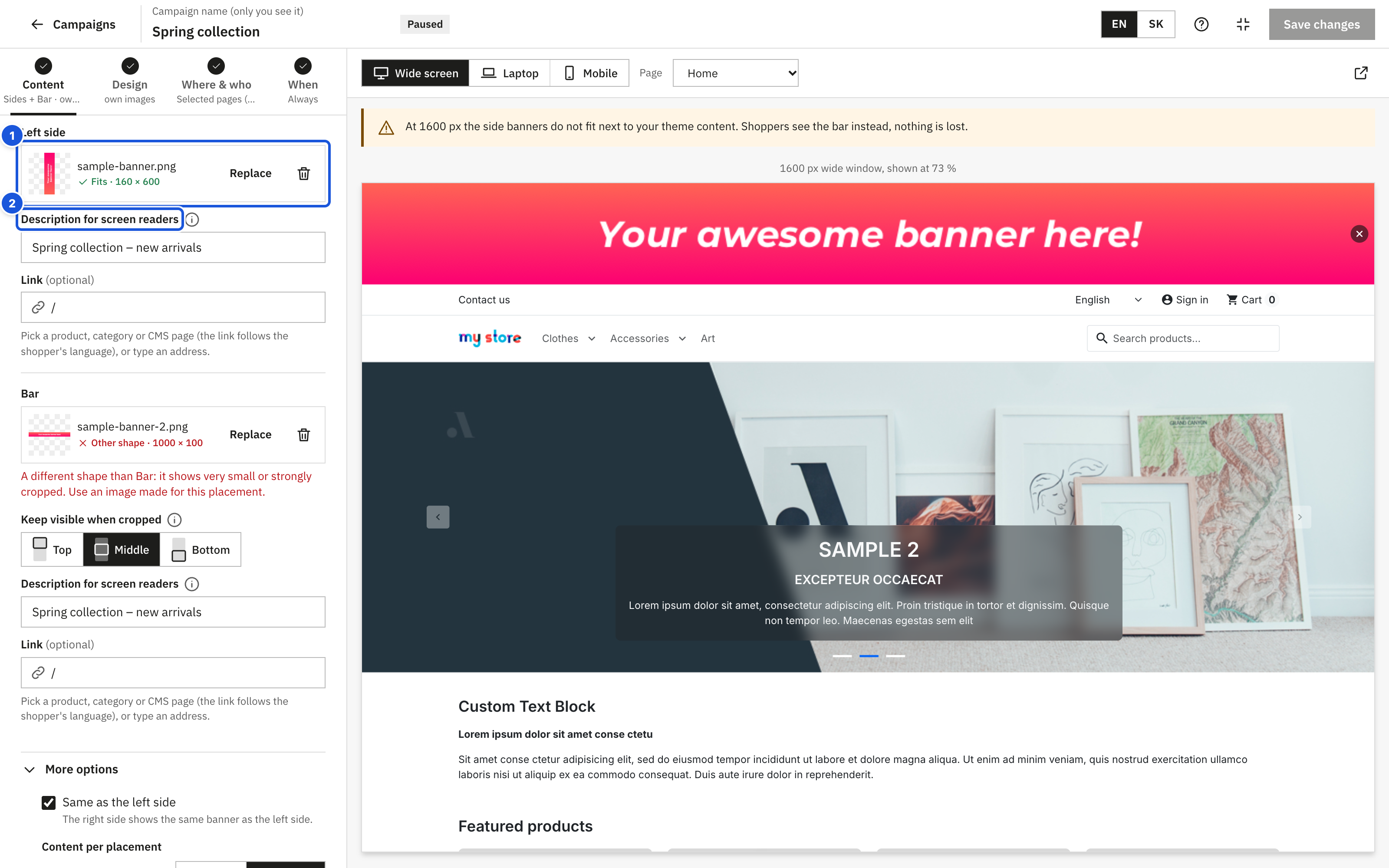
- The image with its rating: Fits, Cropped or Other shape
- Description for screen readers
Keep visible when cropped
Side banners never run past the bottom of the window, and the bar never takes more than a quarter of a phone screen (at most 160 px high). Taller images are cropped. When an image will be cropped, Keep visible when cropped appears under it: choose which part stays, Top, Middle or Bottom (small pictures show the visible part).
Use Replace to pick another image or Remove image to clear the field. Removing an image from a campaign does not delete it from the media library.
Links
The Link field accepts two kinds of targets.
A page of your store (recommended). Type at least two letters of a product, category or CMS page name. Suggestions appear under Pages of your store; pick one with the mouse or the arrow keys and Enter. The field then shows the page type and name.
- The link follows the shopper's language: a shopper browsing in German lands on the German product page.
- If the page is later deleted or disabled, shoppers simply get no link, and the editor shows "This page no longer exists or is disabled. Shoppers get no link. Pick another page."
- Click Remove the link (the × on the right) to clear it.
A typed address. Type an address that starts with / (a page of your store, for example /content/1-delivery) or with https:// (any website). Anything else is refused with "Type an address that starts with / (a page of your store) or https://, or pick a page from the list." The same error appears when you save an address the shop cannot store, for example one containing [, ] or ;. Addresses with accented letters, such as https://shop.sk/kategória, are fine.
Typed addresses are stored per language, so you can enter a different address in each language.
Languages
Texts, images, descriptions, links and countdown texts are stored per language. Switch the language with the buttons at the top of the editor (or the drop-down menu in stores with more than six languages).
A language is incomplete when a switched-on placement has nothing to show in it: no text, code, button or running countdown for a designed banner, or no image for an own-image banner. Shoppers browsing in that language do not see the campaign at all. The editor marks such languages with a dot and shows a notice with a Copy from … button that copies all texts, links and images from a complete language, so you only need to translate.