5. Editor: Design
The Design tab controls how designed banners look: style, colours, typography, details such as the button and the discount code, and shape and motion. The settings apply to all placements of the campaign.
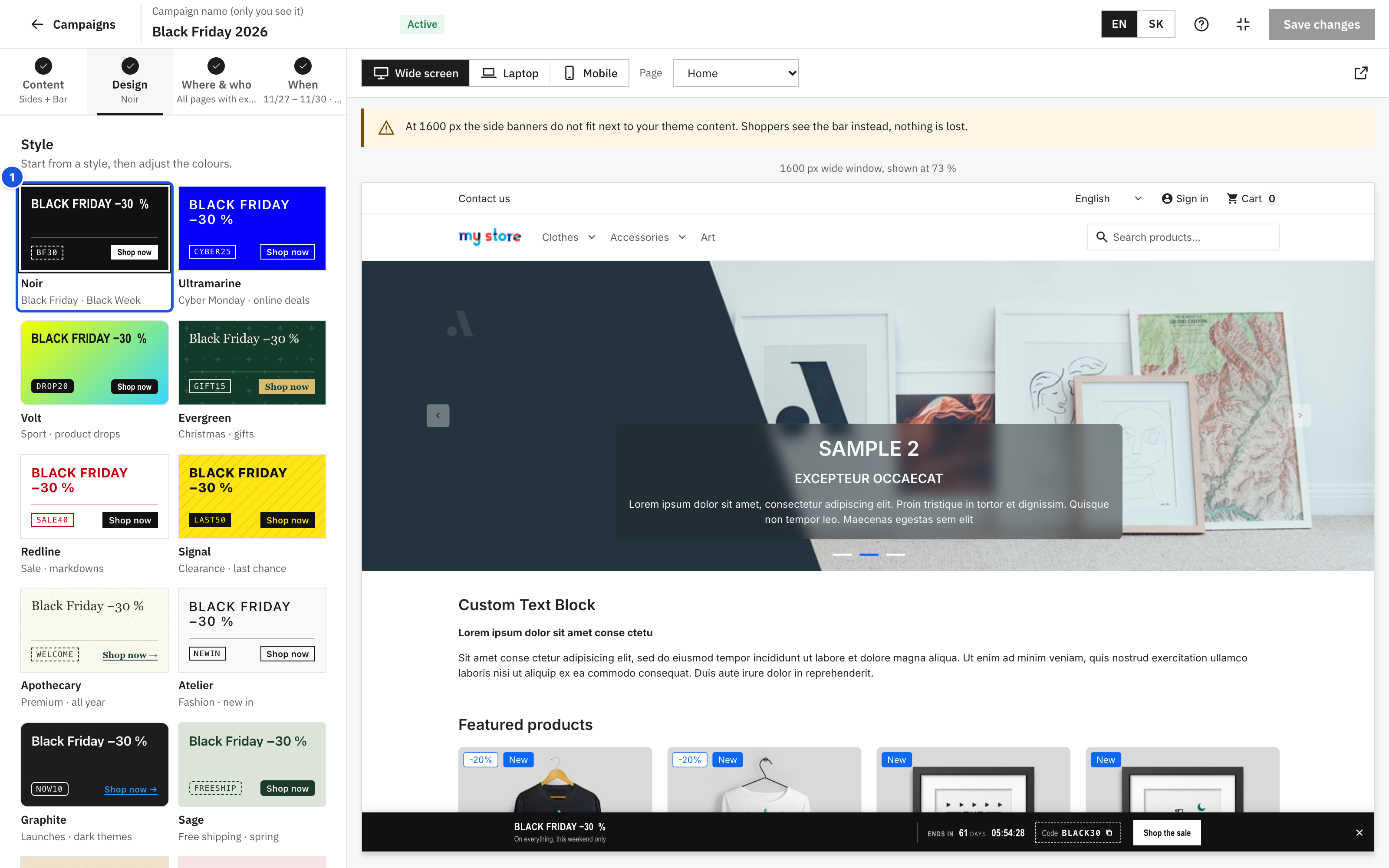
Visible right away are the two things that make most of the look: the Style gallery and the three main Colours, with the contrast check. Everything else – background type and gradient, the other colours, typography, button and code style, pattern, corners and entrance – is under Customise style, collapsed. Its heading lists what differs from a plain design, for example Gradient · Uppercase · Dots · 0 px corners.
Style
Start from a style, then adjust the colours. The gallery shows each style as a real miniature banner with a sample headline and button, and the occasion it suits. Click a style to apply its colours, font, headline look, button and code style, pattern and corner rounding.
| Style | Suits |
|---|---|
| Noir | Black Friday · Black Week |
| Ultramarine | Cyber Monday · online deals |
| Volt | Sport · product drops |
| Evergreen | Christmas · gifts |
| Redline | Sale · markdowns |
| Signal | Clearance · last chance |
| Apothecary | Premium · all year |
| Atelier | Fashion · new in |
| Graphite | Launches · dark themes |
| Sage | Free shipping · spring |
| Terracotta | Summer · travel |
| Blush | Valentine's · beauty |
Templates bring their own style, for example the Black Friday template uses Noir and the Free shipping template Sage. You can switch to any other style at any time; your texts stay.
Colours
| Colour | Where | Used for |
|---|---|---|
| Background colour | visible | Background of the banner (hidden while a gradient is used) |
| Headline | visible | The headline (and the background pattern) |
| Button | visible | The button, and the discount code |
| Supporting text | Customise style > More colours | The supporting text |
| Button text | Customise style > More colours | Text on a filled button |
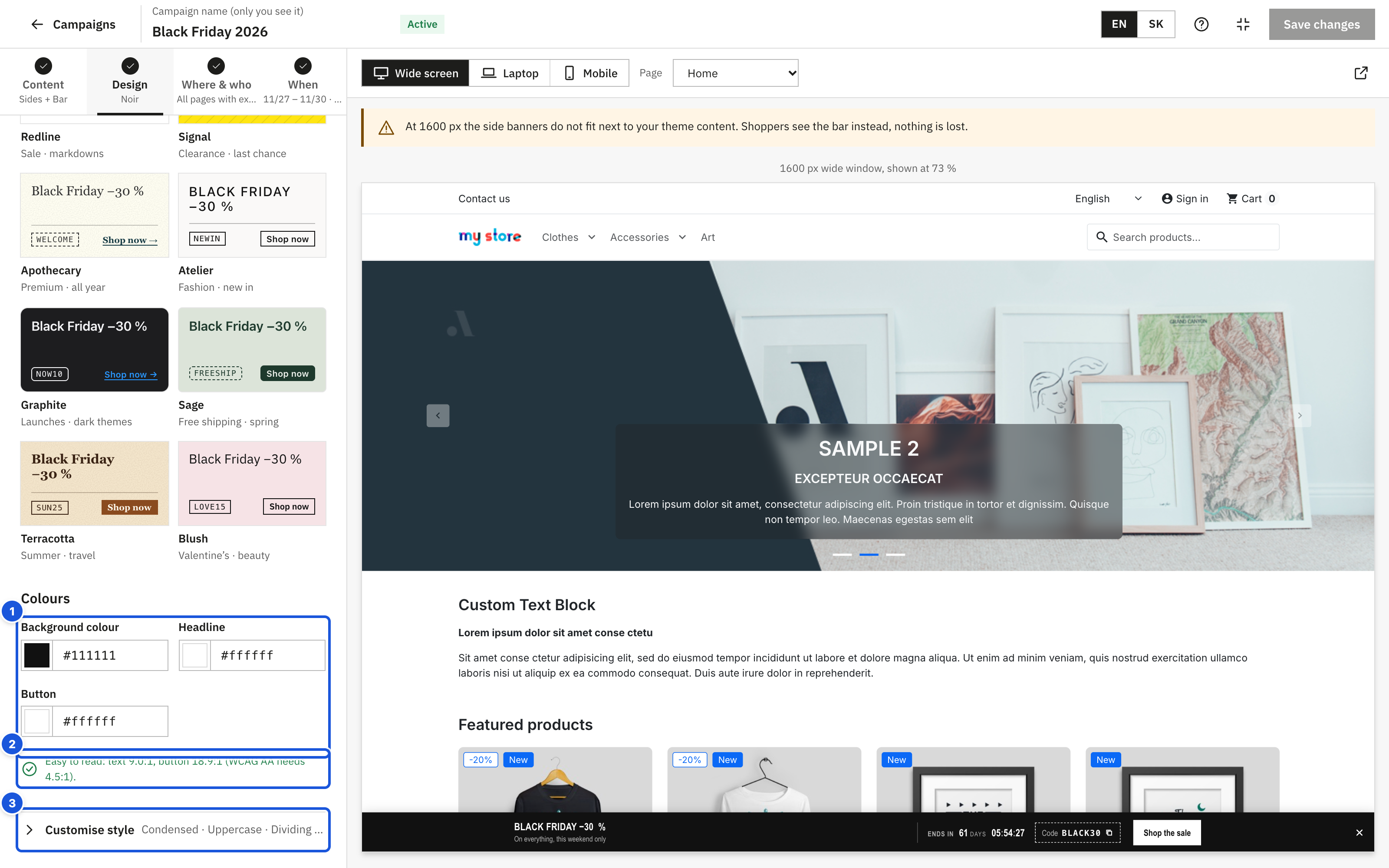
- The three main colours
- The contrast check
- Customise style with a summary of what differs
Pick a colour with the swatch or type a hex code such as #1a1a1a. Once you change anything, the section says Adjusted from the selected style. with a Back to … link that restores the original style.
Background: one colour or a gradient
Under Customise style > Background choose One colour (the default, and what most professional banners use) or Gradient; both options show a small sample. The gradient you set up is kept when you switch back to one colour, so you can compare both.
The gradient editor works like the one in design tools:
- The bar shows the gradient with its colour points (2 to 4). Click the bar to add a point: it takes the colour the gradient already has at that spot.
- Move a point by dragging it, or select it and use the arrow keys (Shift + arrow moves by 10 %, Home and End jump to the ends). Delete or the bin button removes the selected point; a gradient always keeps at least two.
- Point colour and Position set the selected point exactly.
- Angle: quick choices top to bottom (↓), diagonal down (↘), left to right (→) and diagonal up (↗), or any angle from 0 to 359°. The ⇄ button reverses the gradient.
When you first switch to Gradient, it starts from your background colour fading to a slightly lighter (dark colours) or darker (light colours) tone, so the text stays readable. The Volt style uses a gradient.
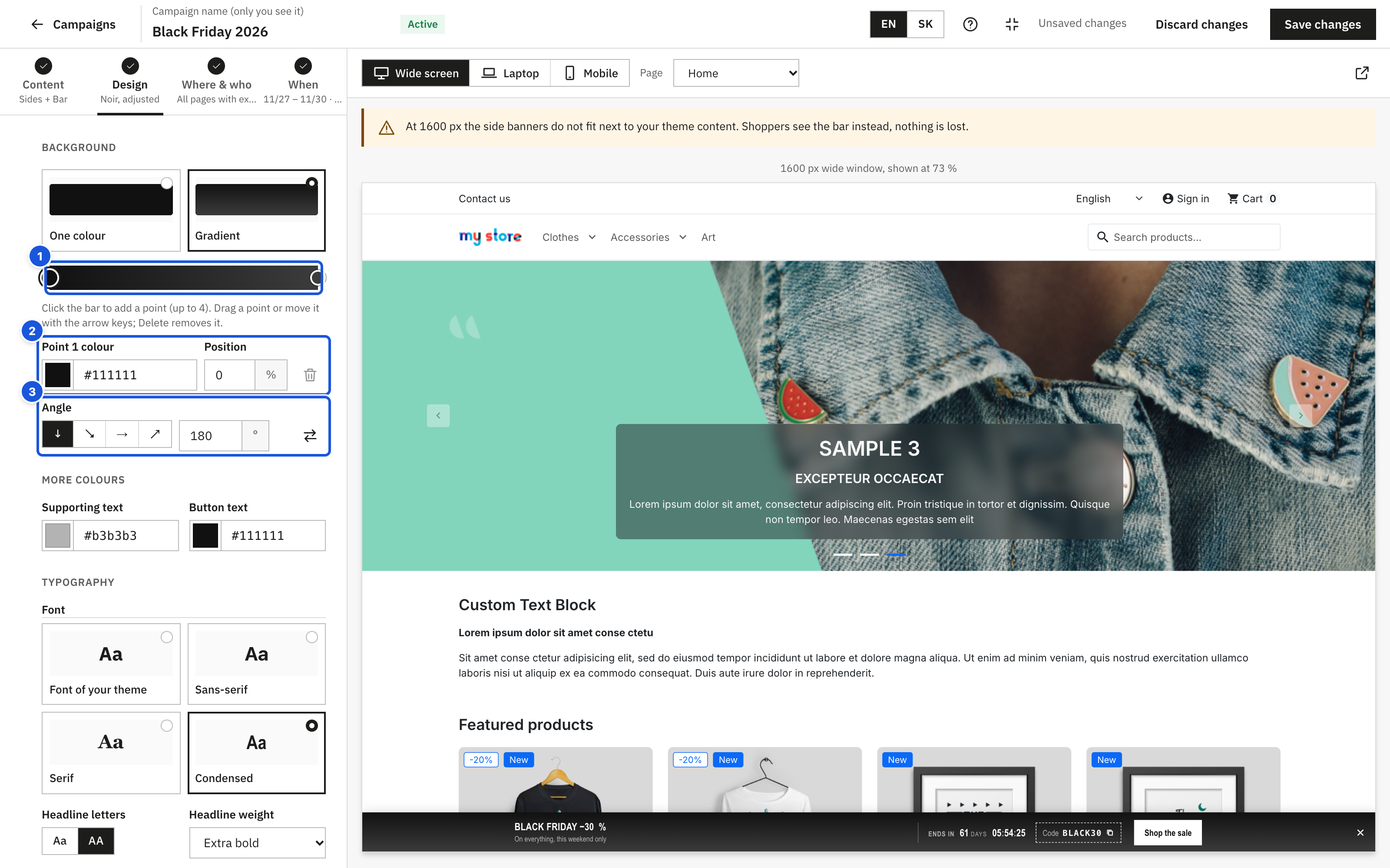
- Colour points: drag them, click the bar to add one
- The selected point: colour and position
- Angle: presets or degrees
Tip: keep the text colour readable on every point. The contrast check below measures it against each colour of the gradient.
Contrast check
Many shoppers cannot read light grey on white or yellow on orange. The editor checks your colours against the WCAG AA accessibility standard, which asks for a contrast of at least 4.5 : 1:
- When the colours pass, you see Easy to read: text 12.3:1, button 8.1:1 (WCAG AA needs 4.5:1).
- When they do not, you see Hard to read with the measured values and a Fix automatically button. It moves the colours towards black or white just enough to pass, keeping the hue where possible.
The check covers the headline and supporting text on the background (on every colour of a gradient), and the button: for a Filled button the button text on the button colour, for an Outline button or Text link the button colour on the background.
A campaign with hard-to-read designed banners cannot be published; the review marks it in red ("The colours are hard to read.").
Customise style: typography, details, shape and motion
The following settings are under Customise style. Choices with a visible effect are shown as small samples in the campaign colours: fonts as "Aa", buttons and discount codes as rendered buttons and codes, entrance as a small animation when you point at it.
Typography
| Setting | Options |
|---|---|
| Font | Font of your theme (matches your store), Sans-serif, Serif or Condensed. The last three are fonts already installed on the shopper's device, so nothing extra is downloaded. |
| Headline letters | Aa (as you typed it) or AA (capitals). |
| Headline weight | Regular, Medium, Semibold, Bold or Extra bold. |
| Letter spacing | From −3 to 15 %. Capital letters need a little space (3–8 %), large mixed-case headlines a little less (−1 to −2 %). |
Details
| Setting | Options |
|---|---|
| Button | Filled (solid button), Outline (frame in the button colour) or Text link (underlined text). |
| Discount code | Filled, Outline or Coupon edge (a dashed border like a cut-out coupon). |
| Thin dividing lines | Separate the headline, countdown and code with hairlines instead of boxes. |
| Background pattern | No pattern, Lines, Dots, Grid, Grain or Stars. Drawn in the headline colour and kept very light, so the text stays easy to read. Own uses your own image (see below). |
| Strength | Shown when a pattern is chosen: 5–100 %. At 50 % the built-in patterns look as designed; 100 % makes them twice as visible. The pattern sits on its own layer, so only the pattern fades, never the text. |
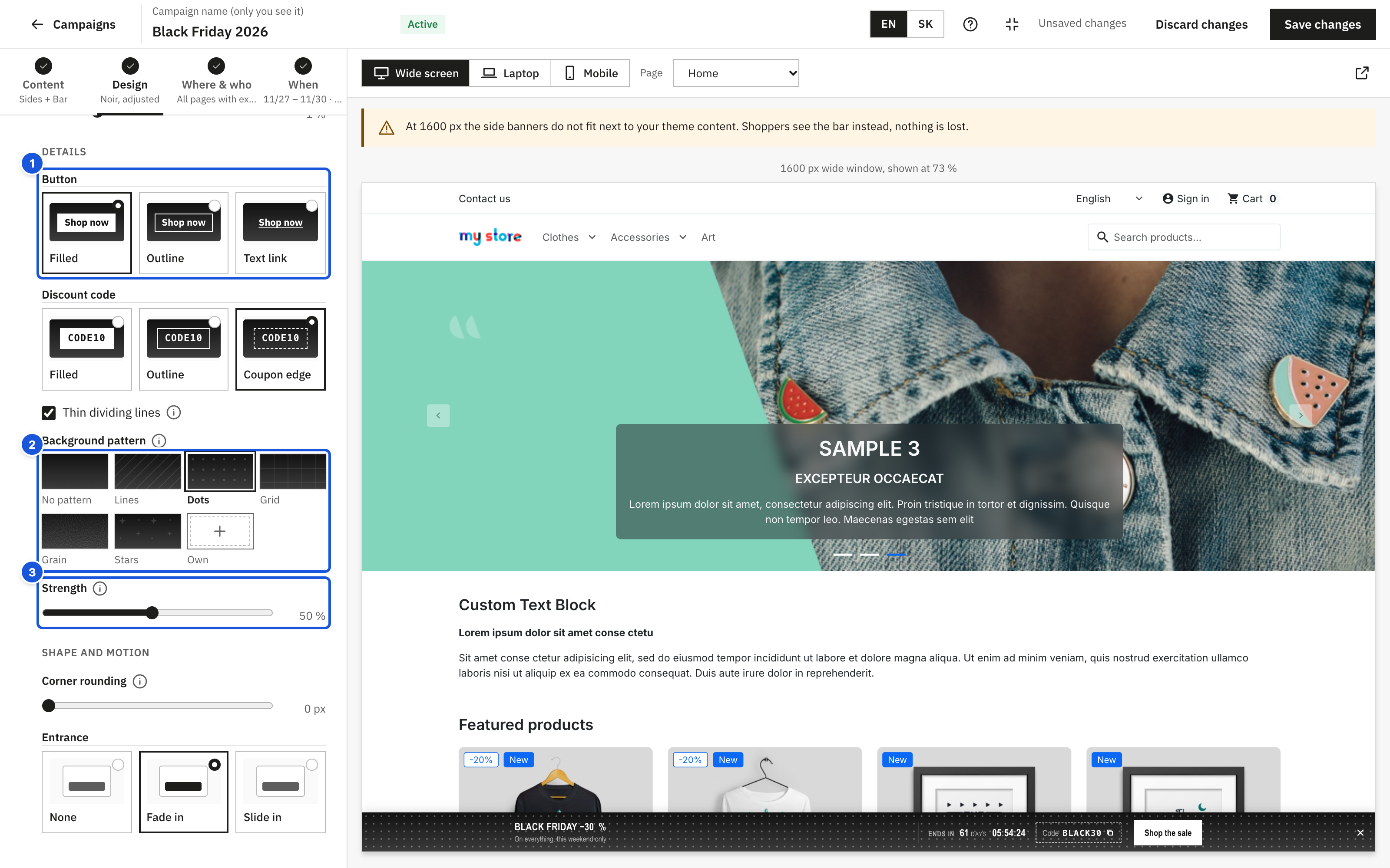
- Button and discount code styles, shown as samples
- Background pattern, or Own for your own tile
- Strength of the pattern
Your own pattern
Choose Own to repeat your own tile over the banner background, for example your logo mark, a brand motif or a seasonal ornament.
- Click Choose or upload a tile. The media library opens; drop a file there or pick one you uploaded before.
- Tile size (8–400 px) sets how wide one tile is on the banner.
- Strength sets how visible it is (see above).
The tile also repeats behind the gradient, if you use one. Until you choose an image, the banner shows no pattern. An image used as a pattern cannot be deleted from the media library while a campaign uses it.
How to prepare a pattern (the same tips are under How to prepare your own pattern in the editor):
- Seamless tile. Whatever leaves the tile on one edge must continue on the opposite edge (left–right, top–bottom), otherwise seams show. Illustrator's Pattern Options show the repeat live while you draw.
- Format. SVG is best: sharp at any size and only a few KB. PNG with a transparent background works too. Use JPG only for full textures such as paper or fabric.
- One colour. Draw the motif in white for dark backgrounds or black for light ones and set the visibility with Strength. Behind text, 15–30 % reads well.
- Size. Export PNG at twice the tile size you set in the editor (a 64 px tile = a 128 × 128 px image), so it stays sharp on high-density screens. Keep the file under 50 KB; large photos are scaled down before the upload.
- Where to get one. Draw it in Figma or Illustrator in a square frame and export it, or use a free generator such as Hero Patterns or Pattern Monster. Check the licence of anything you download.
Tip: a quiet pattern supports the message, a busy one fights it. If the contrast check is green but the text feels hard to read, lower Strength or make the tile larger.
Shape and motion
| Setting | Options |
|---|---|
| Corner rounding | 0 to 12 px. Square corners (0) suit fashion and sale banners; a soft 8–12 px suits calmer designs. |
| Entrance | None, Fade in or Slide in. Shoppers who asked their device to reduce motion see the banner without animation. |
How designed banners look in the store
- Side banners: headline and supporting text at the top, countdown and discount code below, the button at the bottom. The countdown shows digits with small capital unit labels.
- Bar at the bottom on computers: an edge-to-edge strip with the content in one row, up to about 1120 px wide: texts on the left, countdown and discount code on the right. The countdown reads like "61 days 11:23:00".
- Bar on phones: a compact version of the same.
- Typographic details are handled for you: a headline such as "-30 %" is shown with a real minus sign, and the % sign never wraps onto its own line.
Campaigns with your own images only
If every switched-on placement uses Own image, the tab shows the notice "All banners use your own images. The background and headline colours below are used for the countdown shown over the images." The countdown strip then takes the Background colour (slightly transparent) and the Headline colour; keep the contrast check green so the countdown stays readable. The Entrance applies as well. The close button has fixed colours and is not affected by the design.